What does the 25th anniversary of the J12 mean to you?
Firstly, I realize that time flies! When I discovered the J12 at the end of my studies, it was like an electric shock rendering me intensely aware that watchmaking also represented a vast creative territory. It has been a perpetual source of fascination ever since and the J12 remains my muse. Guiding it into unexpected territory is an exercise that still inspires me and I am particularly proud that this cherished project has been able to come to fruition just as the J12 is celebrating its 25th anniversary.
How did you come up with this combination of materials and colors?
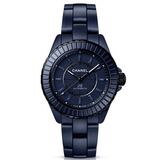
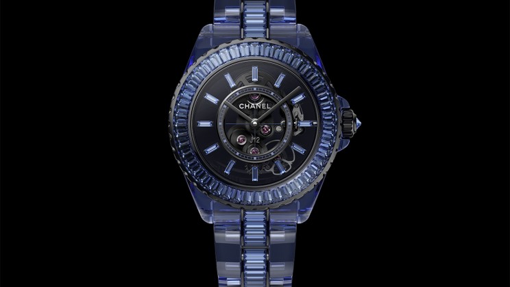
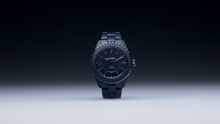
Chanel is a Maison for which exceptional expertise is extremely important across all its fields of activity and has always been a part of its creative process in jewelry, fashion, fragrances and of course watchmaking. This true love of craftsmanship is reflected in Chanel watchmaking through the mastery of ceramics at our Manufacture in La Chaux-de-Fonds. Chanel elevated ceramics to the rank of precious material from its launch in 2000 and that’s very inspirational. In recent years, I have been working more closely with this highly specialized unit to push the boundaries of creativity and innovation both aesthetically and technically. However, Gabrielle Chanel showed on several occasions in her creations that the combination of blue and black could be very successful, contrary to what some people claimed. I found this blue-black duality captivating, as well as the interplay between the matt, muted ceramic and the precious nature of the blackened gold sprinkled with sapphires of a rather distinctive hue. I naturally didn’t specify a Pantone color to aim for; it took countless tests and nearly five years of research to achieve the ultimate emotion generated by this blue. After this long dialog on colorimetry, we achieved very special Haute Horlogerie finishes, such as polished chamfers on the matt case as well as on the side and center links.
What was the most complex part to achieve?
The architecture of the J12 remains immutable. I had the good end of the deal, as my dream was to be able to dress the J12 in this blue, yet obtaining a new ceramic color is an extremely complex task. It reminded me of Grand Feu enamel: you like the color ratios on paper and they are consistent, yet once the pigments come out of the kiln it's a different story and you may have to reload with other pigments to try to achieve your goal. It's not an exact science and it takes a lot of time. I was confronted with a phenomenon of metamerism: the perception of color in the sample differed from that of the finished watch, depending on the environment in which it was worn. I didn't want it to turn red in Dubai or yellow in Munich, depending on which man or woman was wearing it. My role then consisted of calibrating this data by taking the watch with me on my travels, because I needed an elegant and intriguing blue that goes with everything. I am fortunate to be able to work with experts who have exceptional know-how, who are willing to go as far it takes to meet challenges.
In this all-circular composition, what does the diamond in the center of the flying tourbillon represent?
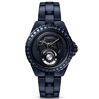
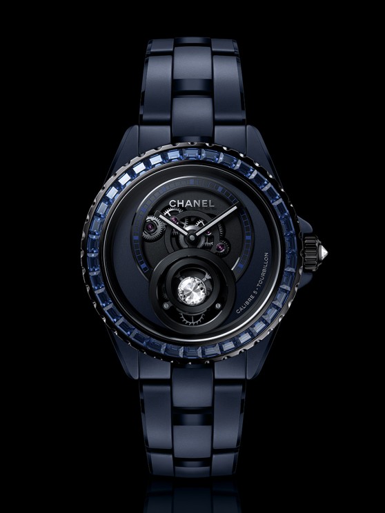
The Chanel style has always been built on male-female duality, which can be found in watchmaking through the paradox of the feminine preciousness of the diamond and the masculine mechanics of the tourbillon. These two notions are opposites that attract and marrying the worlds of Haute Horlogerie and diamonds was coherent for Chanel and for me. It was therefore essential to integrate our Caliber 5 from the start of the new J12 BLEU collection. The diamond adorning the tourbillon carriage requires a special cut that took a long time to perfect, but once again, our jewelry expertise enabled us to achieve this. Above and beyond the technical feat, the result is graphically very successful, with this diamond becoming the visual focal point when you wear the watch on your wrist.
Will this new ceramic color also be applied to more accessible models?
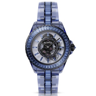
This year, it is only available in limited series, even for the versions that one may consider as “ready-to-wear” models. On the baguette-set version, the bezel is adorned with sapphires that had to be individually sourced. Sapphires traditionally tend towards royal blue and the match with our ceramic would not have been optimal: we wanted sapphires with much less red so as to achieve a perfectly harmonious whole.
What are you expecting from Watches and Wonders?
It's like my fashion show, a dizzying moment because the entire collection is brought together for the first time in one place for a few days. Unlike fashion, development times are extremely long in watchmaking and Haute Horlogerie, meaning that this culminating moment when our creations “grace the runway” is decisive. While the J12 BLEU is our major launch, we also have a very important transversal Capsule collection. We are introducing unexpected creations, including an enamelled ceramic model that people will either love or hate. I am proud of our teams, their know-how, their energy and their desire to push the limits of creativity to a place where relational aspects give way to emotion.
